MCKINNEY NEW BUSINESS PITCH 1
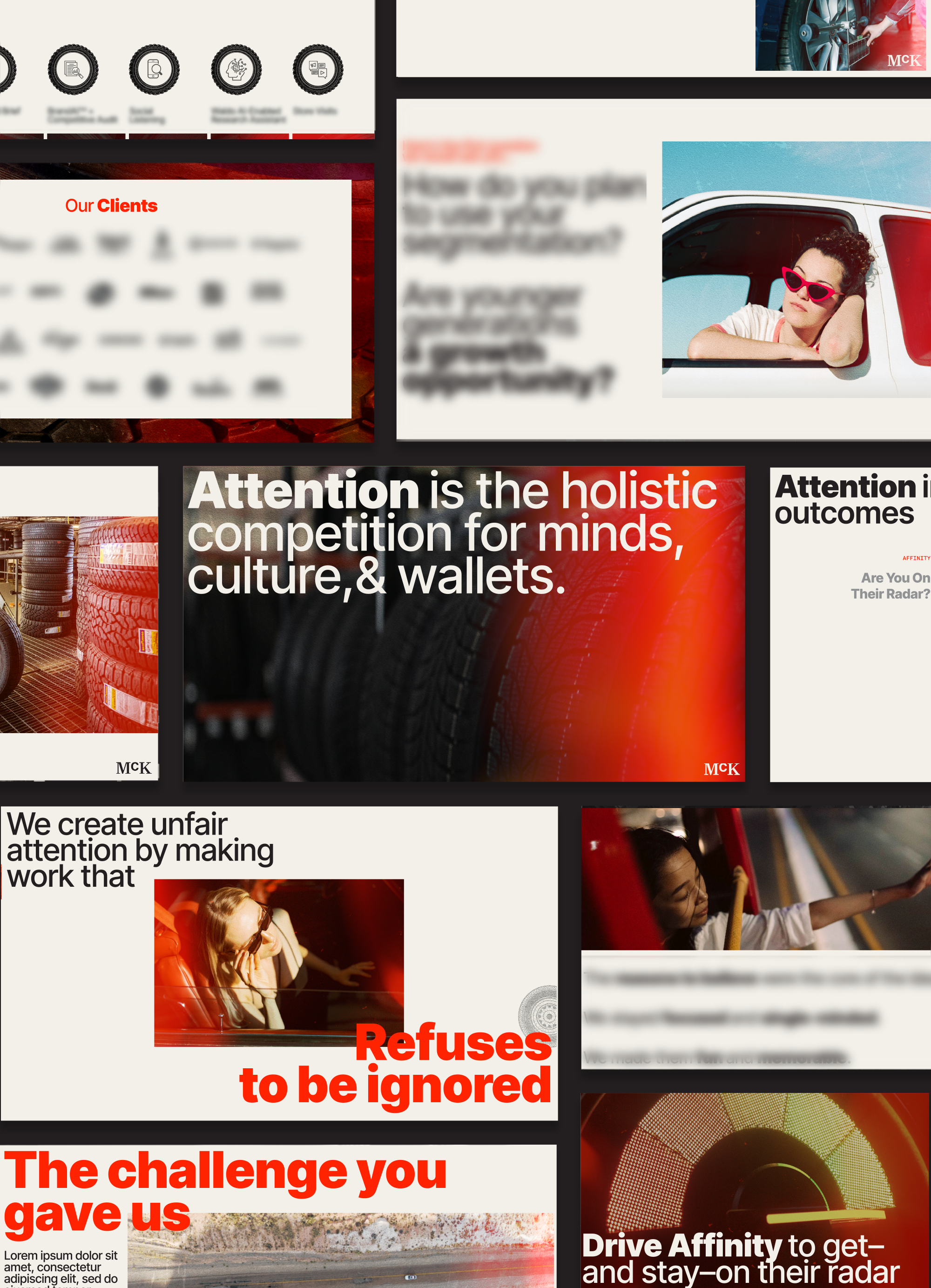
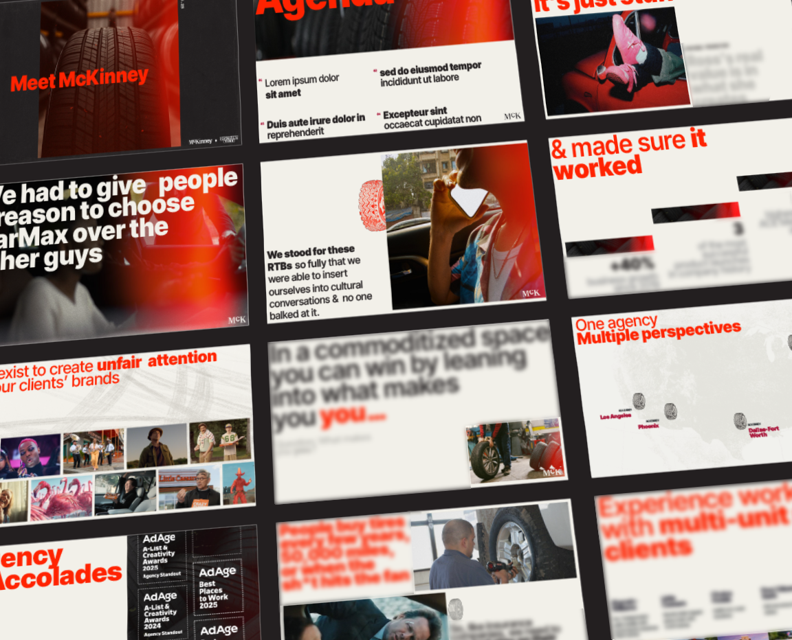
For this new business pitch, I designed within McKinney’s established new business approach, which fuses the core McKinney deck template with brand elements tailored to the client we were pitching. I stayed true to the McKinney brand through typography, layout, and structure, while elevating the system with high-design photography and a stylized retro flare and grain treatment to add depth and character. Custom-designed tire icons were introduced as supplemental elements to anchor key moments and guide attention, allowing powerful imagery to lead the narrative and carry the story throughout the deck.
MCKINNEY NEW BUSINESS PITCH 2
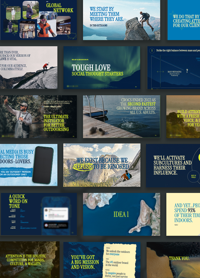
For this B2C business deck, I developed a bespoke visual system that leans heavily on outdoors-focused imagery to capture the brand’s spirit of adventure and connection to nature. Rather than relying on existing McKinney branding, I built an entirely new design language tailored to the client. I wanted it to feel energetic & provocative.
The deck uses expansive, zoomed-out aerial photography to evoke a sense of scale, freedom, and natural awe. This imagery is paired with playful, characterful typography that reflects the brand’s energetic personality without sacrificing clarity. To soften the overall tone and keep the visuals grounded, I introduced sketchy accents and hand-drawn doodles throughout the layouts. The organic touches add a humble, relaxed quality that reinforces the brand’s approachable ethos.
The result is a highly customized presentation system that feels distinct and ownable to the brand, giving the pitch team a clear visual framework to guide their story.
MCKINNEY NEW BUSINESS PITCH 3
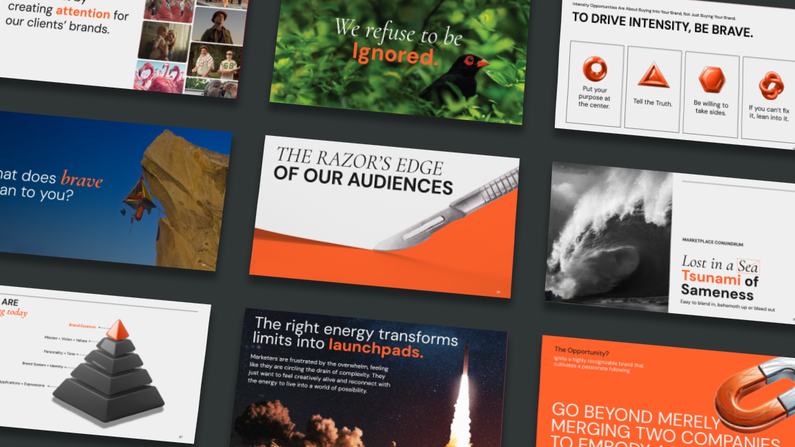
For this B2B new business pitch, I designed a presentation system that feels fresh, modern, and highly intentional. The core of the approach is simplicity with generous white space, clear grids, and minimal layouts that prioritize legibility and help the narrative come through with ease.
To inject energy into the deck, I paired these restrained layouts with full-bleed, nature-inspired imagery that feels bold and slightly provocative. These visuals created moments of impact without overwhelming the content. I also incorporated bright orange abstract, rendered shapes to help visualize and elevate key infographic moments.
Because the pitch centered on a potential rebrand, the overall look and feel was deliberately edgy and forward-leaning. The system was designed not just to present the work, but to model a more daring and contemporary visual direction for the client’s future brand.